Feedback
Press Comments
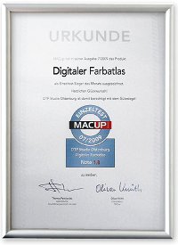
MacUp: "Test winner – profound help in colour communication"
In 2009 we received a small package from the editorial staff of the renowned magazine for Macintosh users.
A charter from the MacUp editors.
They had put our product thoroughly and competently under the microscope.(Article Download)
Quintessenz:
"For those who often work with colours and have to communicate using different matrials and media the Digital Colour Atlas is an optimal companion."
Malerblatt: "An indispensible tool"
In the 02/2009 issue a multiple page article was published that evaluated the DIGITAL COLOUR ATLAS 4.0 very positively:
The digital colour atlas is not only a huge colour hue collection, it is also an indispensible tool for the digital colour composition due to its numerous useful database functions and pleasing additional applications.
Benad Architekturfarben: "...as we emphatically recommend the use..."
Martin and Ursula Benad are two of the leading illusionistic mural painters. Their seminars on colour desgin are well known beyond the German borders. Studio Benad emphatically recommends the DIGITAL COLOUR ATLAS and distributes it to seminar participants. There is an informative, thoroughly critical as well as linguistically amusing product descriptionon the Benad webpage.
Of all the technically brilliant symbolisations of an abstract theoretical concept – please do not forget that this has nothing to do with the essence of the colours... An alternative for every one who has struggled with the tiny colour fields in photoshop. But careful: Adaptation and metamerism will play their tricks on you...
PC Professionell: "Smart colour finder"
An article and a test report have been published in the volume 03/2007.
"For colour professionals the DIGITAL COLOUR ATLAS 3.0 is a good help, he accelerates the search for and comparison of colours. The software doesn’t replace expensive colour folding fans, but the included colour atlas alone is worth the price of 115 Euro" the result reads. Result of the test: "good"
AEC-WEB: "new functions"
A report was published here on Nov 20th, 06.
Already in September the new version of the DIGITAL COLOUR ATLAS has been introduced to the market. The version 3.0 includes some new functions – like e.g. the harmony functions, by them one can let the complementary colour , the brightness – and the saturation contrasts of a colour in the prevailing colour system calculate.
DOCMA (Doc Baumanns Magazine): "...delivers a good service"
The "Photoshop-Pope" described our colour atlas an the topic of colour comparisons at the beginning of 2007.
Although the commonly used DTP programmes include appropriate libraries but often the results are unsatisfactory or the required colour system is not available. Here the Digital Colour Atlas delivers a good service. He enables all thinkable colour comparisons from approximately 150 colour systems and variations of RGB-CMYK outputs.
AGD Magazine: "Customers are marveling: not bad!"
In September 2007 the „Allianz deutscher Designer e.V.“ (Alliance of German Designers) reports in their member’s magazine about our software.
What should be done if the customer wants to use his house colour given in Pantone or HKS on the wall of the building ? Or wants to decorate his porcelaine cups with that ? ... Customers are often marvelling if one sets the house colours in the design manual simultaneousely in the most commonly used colour systems.