Quality and Practicality
The quality of the calculations in this software is better, central practical functions are simpler and more intuitive than in other current tools of graphic designers e.g. InDesign, Illustrator, Photoshop, CorelDRAW, and so on. An excessive claim?
Why are colour matches more exactly?
Using the DIGITAL COULOR ATLAS you can calculate colour comparisons between colour systems or from and to CMYK. In order to look at the question of quality lets take the difficult case of balance in CMYK and visa versa.
This Lab/CMYK conversion is built in numerous kinds of graphic software. It is made commonly by so called „ICC-Profiles“. The procedure is perfected so that even professional users with high quality demands can adjust colourful files via ICC-profile, e.g. for the offset print.
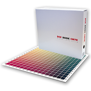
The DCS BOOK Pro from grafipress: 65000 CMYK-colour fields were individually measured for the software.
But: Those who attempt to use an ICC profile to convert a specific colour highly accurately into CMYK, will determine: the result is too impercise – but there is a better way of doing this colour match, if we use a CMYK atlas and search the best suitable colour field visually in this atlas.
How so? An ICC profile contains about 1,500 interpolation points, in between which the comparison colours are mathematically interpolated. This is by no means enough to filter out the best fitting field from the about 5,000 CMYK colour fields within a sensible atlas.
We have measured all CMYK-colour fields of the supplied atlases (handinhandbuch: 6000 Felder, DCS BOOK Pro: 65000 Farbfelder) individually using a spectralphotometer. The software application searches the CMYK colour field within this database which has the lowest colour distance (Delta E) to the pattern colour. The software really filters the colour field which has the nearest distance and in no case only the approximate calculated average.
For the colour atlas we did a complete spectral photometric measurement of all of the supported colour atlases and colour systems in various colour fields and stored it as a database with about 200,000 CIEL*a*b measurement values.
To conclude it: The precision is equal to the experienced human eye – but only many times faster!
One case should not be swept under the rug: Individual colours and colour lists are converted by the colour atlas at a good speed – however for the conversion of image files with millions of pixels the speed is simply not fast enough. Therefore CMYK-image conversion was not integrated into the software.
Why are the colour harmonies of the colour atlas more harmonius?
Also other software products are availabe which calculate complementary contrasts, opposite colours or other symphonies. This is possible in many graphic applications (Corel, Freehand, ...). But there is a decisive difference. The calculations are normally made using the HSB/HSV/HSL model which is based on the RGB-colour area.
However the harmonies in the DIGITAL COLOUR ATLAS are calculated with the CIEL*a*b colour model. This is the calculabe colour model which is nearest to our visual perception. RGB is an equipment based calculation model for colours, CIEL*a*b is a perception based one.
This is not an only theoretical thinking. CIEL*a*b is actually more senseful and regularly delivers results which are related to the perception. Thus for example a regular increase of the CIEL*a*b-L is also steady for the perception of the eyes, a regular increase of the brightness of the HSB-model not at all.
For those who are interested in mathematics: our perception functions extensively logarithmic: high sensitivity at a low level of the stimulus; how larger the intensity how lower the sensitivity. The CIEL*a*b ruling is made according to this quality. However RGB (and therefore also HSB/HSL) has a linear scale, we perceive steady increases as uneven and unpleasant here.
Two examples should explain these facts:
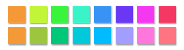
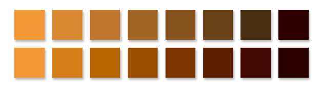
A complementary contrast and a brightness variation to orange – each calculated above in HSB, below in CIEL*a*b*.
In fact the example was chosen just randomly, other initial colours or types of symphonies let us expect similar significant differences in the quality delivered.
Why is the colour matching with the COLOUR ATLAS more intuitive?
A daily routine in every company is the matching of initial colours on the screen, at the printer or for the printing process of the printing house. If the desired colour is derived from a commonly used system of a manufacturer and has to be converted to a standard this can be done fastly and exactly using the window "Next colours".
But not every colour sample is originating from a preset olour system and not every equipment is in command of the standards of RGB or European scale. Then also with the DIGITAL COLOUR ATLAS handiwork is called for, which also is denominated as „colour matching“.
Easy Matching for colour matching on the screen
The EasyMatching window is a easy to use and an exact tool for RGB colour matches. The highlight: There is no typing in of numbers, not even slide controls. You adapt the colour to the pattern by just pulling the mouse. Herewith the colour doesn’t change in the way it would be the case with using the RGB System, but according to CIELAB far more according to the perception. It’s not easy to describe that only by using the written language, but the colour matching with EasyMatching is nearly as easy to handle as just thinking about the matching – and immediately done. Just try it, the complimentary and free of charge demo version contains the unlimited EasyMatching!
PDF atlases for the colour matching of printing results
With printable RGB – and CMYK atlases in the type of PDF files you receive complete colour references for the colour matching of your printing results. Here you can determine e. g. for an own pattern sample the RGB or CMYK values, using this values this can be exactly reproduced by printing it. This is also working with a tinged printer.