Colour Harmony · Complementary Contrast
Which complementary colours supplement a starting colour harmonically?Vernacular says "Opposites attract".
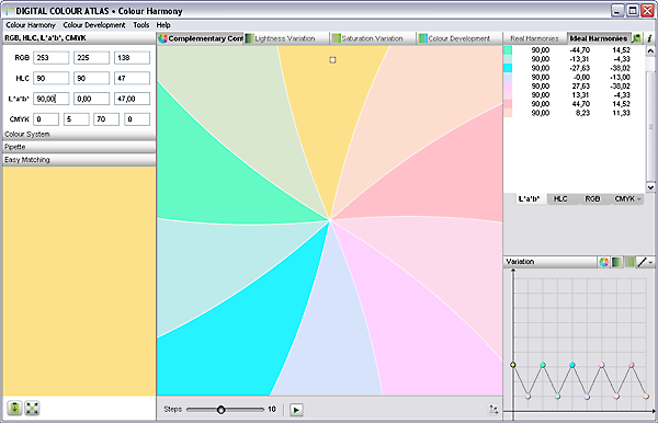
The opportunity to contrast the starting colour with complementary colours presents itself with this window. Complementary colours help each other to reach higher intensity, it creates a lively mood, in the extreme it creates a dramatic effect, and when employed skillfully it creates a harmonic overall picture.
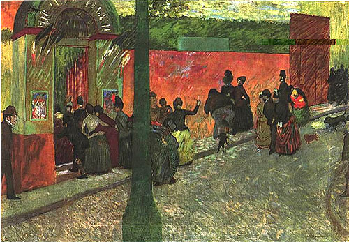
Federico Zandomeneghi: "Le Moulin de la Galette", 1878, 80 x 120 cm
Variations of the complementary colours red-orange and yellow-green provide for a tension filled, harmonic whole.
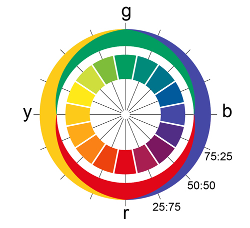
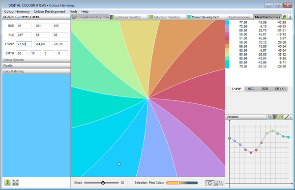
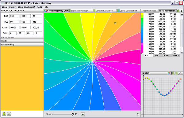
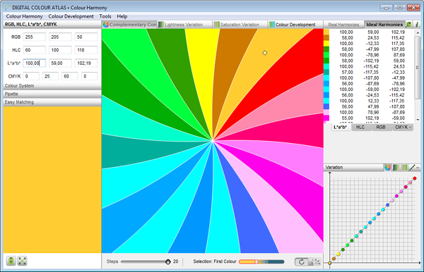
In the first step the window ascertains the ideal typical colours, which result in a n-Eck in the CIELAB colour circle of the same brightness and saturation when taken with the starting colour. In each case you can indicate the next closest colour to the ideal typical addition in the chosen colour model by using “show real colours”.
This variation is also referred to as hue contrast or colourful type contrast.
The Complementary Contrast according to Hering, Itten, Ostwald and Goethe
Ewald Herings complementary colour wheel is based on the observation that the intense study of a colour stimulus evokes an afterimage of the complementary colour in us. Colour stimulus and afterimage respectively always lie across from each other.
The outer circle shows the four base colour perceptions as determined by Hering.
An old rule according to Johannes Itten and Willhelm Ostwald states that colours fit together harmonically when mixed together they become achromatic (grey). The rule is based on the psychological tenet that humans perceive tensions as uncomfortable and attemtp to balance them out. Nobody could express it better than...
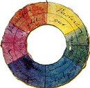
Farbkreis nach Goethe
When the eye sees a colour it is immediately excited, and it is its nature, spontaneously and of necessity, at once to produce another, which with the original colour comprehends the whole chromatic scale.
A single colour excites, by a specific sensation, the tendency to universality. In order to become aware of this totality and to satisfy itself, it searches for a colourless space next to every colourful one, in order to bring out the required colour therein.
In this resides the fundamental law of all harmony of colours...
— Johann Wolfgang von Goethe
This principle of colour harmony has not lost any of its relevance even after over 200 years!
The complementary contrast is as manifold as life itself and stands for an easy going, natural vibrancy.
The Complementary Contrast in the CIELAB Color Model
Carried over into today’s CIELAB colour model the rule is as follows in mathematical form: The CIELAB colour values from two or more harmonic colours result in a mean of a neutral CIELAB colour value (a = b = 0) or in a HLC colour value in which C = 0.
Brief Instruction
- Select „Colour harmony“ and the first button of the harmony variants.
- Choose the starting colour of the harmony calculation. Either by entering colour values or by selecting one of the included colour systems.
- You can select the number of steps (including the starting colour) below the result rectangle.
- Using the results-list calculate with "Colour system" either...
- ideal type complementary colours (colour values), or
- the colours located closest to these results as well as their variances ∆E to the according calculated ideal colour.
- Vary the preset complemtary contrast in colour hue, lightness and saturation with the handles in the area "Variation".
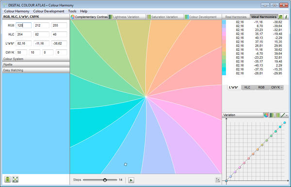
An original colour is supplemented through 13 opposing colours of equal lightness and saturation.
In using a lightness variation the results are more lively.
Yellow is lighter than blue. If the lightness stays the same then the blue is too light or the yellow is too dark (see first screen shot). In order to achieve strongly saturated colour hues the lightness in the yellow area had to be raised and in the blue area it was lowered.
Every other lightness was lowered.
In a pastel colour wheel every other saturation was lowered.
Further Function
A click on the PDF button opens a window which includes the results in a well arranged form combined on one page.
You can also display the complementary contrast also as HLC-, RGB– or CMYK-colour values. The RGB is based on the sRGB convertation of the ideal Lab colours, CMYK is based on the art print version (Offset coated paper).
Double click on any given colour in the results field the colour will create a new complementary contrast for the newly specified colour.
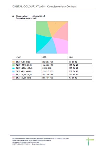
All of the information to the chosen complementary contrast is stored in the pdf file.
Complementary Colours
A variantion gains a particular significance when the number of grades selected is set to "2" and the "Ideal" setting is check marked. The two resulting colour tones are exact complentary colours (contrast colours). The show the largest possible dissimilarity, mixing them would result in grey.
Two strongly saturated complementary colours are generally not harmonic. The contrast between the two is too large, the tension created too strong, so that we no longer perceive them as pleasing. In contrast to that, complementary pastel tones do appear harmonic, as the created tension is pleasing to us.