Next Colours
Which colour of colour system B is equal to a requested colour from colour system A?This window enables all thinkable comparisons of colour systems regardless the direction. Hereby you can respond to questions e.g. which colour of my system is matching a given HKS (J+S), which CMYK are used for that colour in offset or new printing, which ORAFOL foil for the lettering of cars. Also it can be approached differently: Find the matching Brillux colours corresponding to a photographed face of a building (extract the RGB colour values with a pipette) or RGB/CMYK of a colour sample measured by a spectrophotmeter... As mentioned all thinkable directions are possible and the window performs even more!
So you will find a similar colour tone of a colour system
- Indicate the originating colour on the left.
- Select the type of the colour system group on the right and the wanted colour system.
- The three nearest colour tones and their colour distance, ∆E, from the original colour are calculated.
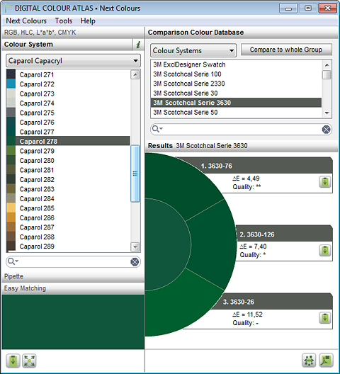
Which 3M foil matches a Caparol colour?
Group comparison
You can also search through multiple colour systems (system groups) for an input colour. Doing this the best three comparison colours are displayed at first. With a click on the list symbol a list appears in which the best results of each colour system are displayed.
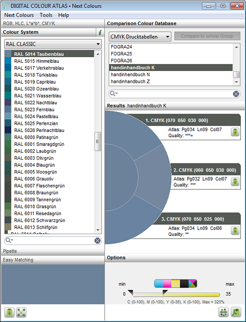
This way you'll find CMYK– or printer RGB values corresponding to an original colour
- Indicate the originating colour on the left.
- Select the "RGB 'Atlases" or "CMYK Atlases" and the concerning atlas.
- The three nearest colour tones and their colour distance, ∆E, from the originating colour are calculated.
- Additionally the position of a comparison field in the atlas is stated (page, row, column).
Attention: "RGB Atlanten" deliver no commonly used RGB-values but optimized RGB-values for the print on specific printers which are deviate from the RGB norm in respect of the colour. Here prints and measurements of the RGB atlas file are the base (see PDF test files).
The Checkbox "Optimal compare"
If the target colour system is a RGB or CMYK-atlas, the programme calculates an average value of the three nearest RGB or CMYK colour fields. If the target colour system is a colour system, it calculates an average value of sRGB colour values of the three nearest colour tones. This average value is indirect proportional weighted according to the mistake ∆Em which the colour fields have according to the originating colour. This means: A colour field with a small deviation is integrated more strongly to the average value als one with a larger ∆E. Thus a reliably working and highly accurate comparison colour is reached.
An "Optimal compare" is only possible if the original colour is within the colour area of the output device. In regard to colours which are beyond the representable colour area (e.g. fluorecent colours) the calculation of an average value doesn't make a sense.
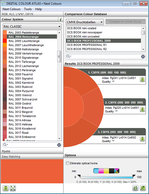
A system colour is converted in CMYK. The colour tone can be looked up in the supplemental CMYK-Atlas on page 34, line 9, column 7.
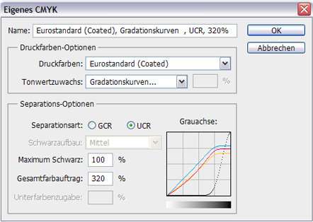
The CMYK-Controller
Using this the minimal and maximal colour applications in cyan, magenta, yellow and black can be steered individually as well as the maximum complete colour application C+M+Y+K.
Example of use: Best possible pure chromatic colour
For the best possible pure chromatic colours opposing colours and black can be logically eliminated from the calculation.
If a best possible pure orange is, e.g., to be printed, it makes sense, to elimnate cyan and black. Both colours have no business being in orange as they impede the colour intensity. Likewise yellow should be set to 100% – that way you can prevent an unattractive yellow grid.
The settings would be: Cmax = 0, Mmin = 0, Mmax = 100, Ymin = 100, Kmax= 0
Example of use: black composition, under colour reduction, achromatic composition
Often it is important to reduce CMY in favour of black whether out of financial reasons or in order to apply as little as possible colour (better drying characteristics). There is a process for this called UCR and GCR:
| Procedure | Description |
|---|---|
| UCR: Under Color Removal, Unterfarbenreduktion | Here the print colours cyan, magenta and yellow are replaced with black but only in neutral areas (i.e. only in grey colours, so in areas with about the same parts of cyan, magenta and yellow). |
| GCR: Grey Component Replacement, Unbuntaufbau | Here parts of cyan, magenta and yellow are replaced by black print colours in colourful as well as neutral areas. This process extends further than UCR as it is not only for grey, but for any given colour tone with a combined portion of CMY. |
The replacement of the grey portions through black has its drawbacks. The colour brilliance dwindles, grey portions always appear a little more “flat“. Therefore it is more advantageous to print e.g. skin tones or preferably natural colour tones without a black portion (UCR).
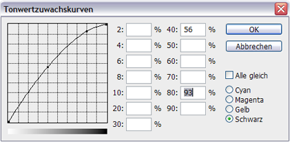
How are the CMY-portions reasonably replaced with black? Here the UCR process in Photoshop.
Often there needs to be a compromise between:
- more black, less CMY: less costs, higher colour stability, less print problems
- more CMY, less black: elevated natualness in the colour
The K-tone value increase of the DCS BOOK Professional in Photoshop
This can be guided with the controller. Only colours with a black portion within the chosen interval are considered.
Caution: Even if the DIGITAL COLOUR ATLAS permits the following, it makes no sense, e.g. to create a chromatic colour with a high minimal black portion or to create a dark grey without a black portion. In the print preview this will be abundantly clear.
The controller "Maximum C+M+Y+K"
High portions of CMYK result in dark colour tones, there are limits to this: the higher the complete colour application (C+M+Y+K), the longer the dry time of the printed paper takes. The complete colour application should, depending on type of paper, not go over 200-350%.
The first version of the ICC-profile "ISO Coated V2" contained up to 330% colour application, a second version “ISO Coated V2 300“ merely goes up to 300%. After quick research with printers we can recommend the approximate following values:
| Paper | Colour application |
|---|---|
| Coated Paper | 300-320% |
| Uncoated Paper | 260-300% |
| Newsprint | 240-260% |
This controller is especially important for calculations with the DCS-BOOK-Databases, as their colour fields reach up to 400% colour application. With the handinhandbuch-data a maximum of 350% is achieved.
Hints
Ask your printer, or stay safe with the following values: For a deep black we never recommend 400% colour application, rather a CMYK(50 0 0 100) or CMYK(0 0 50 100) (cold or warm nuances).
Eliminate Optical Twins
This function is only available with the DCS BOOK databases. A multitude of CMYK-colour fields from the DCS Book have a uniform appearance. Especially for the dark, little saturated colour tones there is a multitude of possible CMYK-values. "Eliminate optical duplicates" leaves CMYK-values, that look the same with higher black portions, out of the calculation.
Are the colour comparisons and colour values really precise?
When we are looking for the CMYK-value to a specific colour we don’t generally rely on software. We take a CMYK-Atlas, printed according to print standards, and search under day light or standard light for the best matching colour field. The DIGITAL COLOUR ATLAS does the same thing – only much faster!
The software calculates the colour distance to the input colour for all CMYK-colour fields and displays those that have the smallest distance. The precision is equal to the trained eye. You can verify the results with the supplemental atlases.
In the background of the DIGITAL COLOUR ATLAS is a database in which spectrophotometric measurement values of all the colours in every coloursystem and atlases have been stored. This database was and is a big piece of the manual labour: In the handinhandbuch there were ca. 18000 colour fields to be individually measured, the DCS BOOK Professional 65000, many colour systems had more than 1000 colour tones. The colour value database is the actual heart of the software, it determines the value of the DIGITAL COLOUR ATLAS – through it the colour calculations are very accurate.
CMYK-values can also be determined in e.g. Photoshop. The CMYK-calculation takes place over an ICC-profile. There are between 400 and 1500 stored data points that are the result of a measurement of a test chart. The conversion filters out the closest data points and interpolates the middle values. Our DIGITAL COLOUR ATLAS functions just so, however in the case of the handinhandbuch it has ca. 5,000 CMYK-data points available, with the DCS BOOK Pro there are ca. 65,000!
About the Colour Distance ∆E
The colour gap ∆E is based on the definition from the International Lighting commission (Commission Internationale de l’Eclairage; CIE) from 1976 and is the common measure for colour variations in industrial practice. The smaller the ∆E, the better the match of the two colours. The calculation finds the colour tone with the smallest CIELAB colour gap ∆E to the starting colour. In the software an evaluation of the results takes place according to the following table:
| ΔE | Quality | The two colours are... |
|---|---|---|
| < 0,5 | * * * ++ | virtually not distinguishable |
| < 1 | * * * + | for the practiced eye distinguishable |
| < 2 | * * * | distinguishable |
| < 5 | * * | slightly different |
| < 10 | * | different, but still fairly similar |
| ≥ 10 | - | obviously different |
obviously different This evaluation is only approximate in nature. The eye is much more sensitive to bright, unsaturated areas than it is to dark or heavily saturated colour areas. In other words: A ∆E = 2 leads to an obviously deviating colour when dealing with a pastel colour, whereas ∆E = 2 would be barely noticeable with a dark colour tones. The eye is also more sensitive when it comes to the orange and yellow colour areas than the ∆E value initially reveals.
In a few cases, especially those with large dE values, agreeing colours will be determined which, from the standpoint of visual perception, do not agree. The computer finds, e.g., for a HKS 18 K (L=25, a*=64, b*=5) the colour tone 4004 Bordeaux Violet. The eye would sooner choose 3004 Purple Red. This effect results primarily from the fact that the spacing formula (based on Hunter) gives the colour's brightness and colourfulness just as much weight in the evaluation as it does the colour type: HKS 18 K and 4004 Bordeaux Violet actually agree quite well in saturation and brightness. Furthermore, a colour tone deviation in the inner region of the CIELAB colour space (with less colourful colours) only involves a very small dE difference although the actual colour difference is very visible.
Our Measurement Conditions
It is best to apply the measurement conditions used when determining the CIELAB colour values to the agreeing colours as well. This way, no uncontrollable results will be generated:
- Measurement equipment: Techkon SP 810 Lambda
- Standard light D65
- Standard observer according to CIE 1964